Do you want a high conversion rate? Then an amazing website design is what you need! In this article, we have mentioned the Top 10 eCommerce website designs, you can get inspired from. These website designs are unique in their own way, let’s find out how. You can contact a web designer in Jaipur, for getting the best website design made.
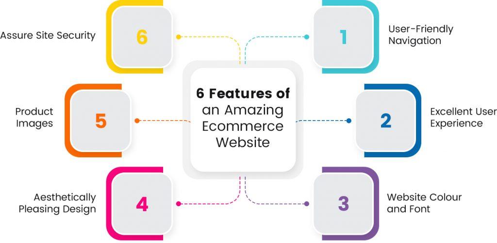
6 Features of an Amazing Ecommerce Website

1. User-Friendly Navigation
The primary menu, on-site search, filters, product category pages, and anything you put in your footer are all part of your website’s navigation. Because the goal of navigation is to make it simple for customers to locate what they’re looking for, your navigation process should be as condensed as possible, minimizing the number of paths a user must follow. Bonus: Because search engines can better crawl your site with well-designed navigation, it will help with SEO in addition to making it easier for customers to discover what they want.
2. Excellent User Experience
The method design teams employ to produce products that offer customers meaningful and pertinent experiences is known as user experience (UX) design. UX design includes components of branding, design, usability, and function in the design of the full process of obtaining and integrating the product.
3. Website Colour and Font
Your site’s colors and fonts are also an important design consideration. We’ve all been to a website that looks like it’s a holdover from the early 1990s. Unless that’s your gimmick, don’t do it. Stick to a sleek and simple eCommerce website design with just two colors. If you want to get really wild, add an accent color in, too. You’ll also want to choose two fonts—one for headings and one for body copy—that work well together. If you want to keep things, even more, simple, you can stick with a single font.
4. Aesthetically Pleasing Design
There are still a number of things you can do to make your website more aesthetically pleasing even if it’s unlikely you’ll develop an eCommerce website that attracts every visitor who visits your site. Fonts, photos, your layout, and more are all included in this. Keep in mind that your eCommerce website serves as your first impression.
5. Product Images
Customers that visit your eCommerce store use the product photos to decide whether or not to make a purchase. The use of attractive and high-quality product photos is crucial for this reason. When you choose a white background for your product photographs, you draw attention directly to your product and make it simpler for customers to view its intricacies.
6. Assure Site Security
When making an online purchase, you most likely use a credit card or a payment method like PayPal that is directly linked to your bank account. You must reassure your clients that providing bank information on your site is secure and not fraudulent. The majority of customers seek for trust indicators to determine whether they can trust your website with their sensitive personal data.
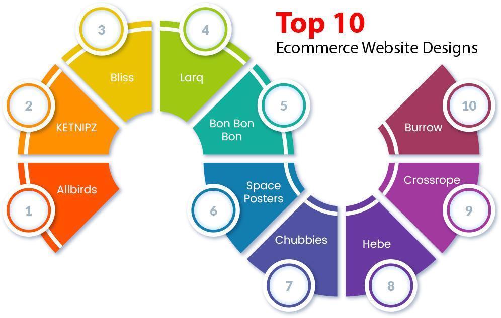
Top 10 Ecommerce Website Designs:

1. Allbirds
Allbirds is a clothing retailer that emphasizes environmental responsibility and sustainability. Their website design is impressive because of the content, call-to-action buttons, and product images. With marketing like “Break a sweat, not the planet” and “running shoes manufactured with natural materials,” they highlight what makes their clothing different from other clothing while also including high-quality photographs of their clothing in use.
2. KETNIPZ
Harry Hambley first launched KETNIPZ as an Instagram comic, but it has since grown into a massive enterprise. The main character of the comic, Bean, appears in murals, tattoos, and on other social media platforms. The website is quirky and entertaining, just like the comic, and it makes use of vibrant colours and amusing fonts to keep viewers interested. This company definitely understands how to connect with its target market.
3. Bliss
Bliss’ website, which uses BigCommerce as its backend, was a nominee for the platform’s Best Overall Design award in 2020. Bright colours are used to generate a playful vibe. You’ll feel upbeat and energized just by using their website. Imagine for a moment how you will feel after utilizing one of their skincare products.
4. Larq
A great example of how product photos may effectively market a product is LARQ. The brand also has a great design and excellent copywriting, which together make for one of the best eCommerce sites. You may calculate how many plastic water bottles you have saved from landfills by using your LARQ water bottle by utilizing the plastic waste calculator that is included with LARQ.
5. Bon Bon Bon
Artisanal chocolates are sold by Bon Bon Bon, a Detroit-based company. When it comes to using colour, they don’t hold back, and their boldness pays dividends. Their website’s design successfully conveys their inventiveness and encapsulates the essence of the business. It is enjoyable to interact with their website, from the main page to the cart page.
6. Space Posters
Selling minimalist posters with images of, well, space. The website is pleasantly simple and perfectly complements the store’s merchandise. The website is a simple black-and-white design with some quirky fonts and an animation that resembles planets in orbit.
7. Chubbies
Chubbies’ website design, like many others on our list, doesn’t shy away from using color. After all, it would be foolish not to exhibit your real colours if your products are as vivid as the shorts they are selling. It also employs sharp, humorous copy. On their main page, they mention everything they stand for, including weekends, the idea that “short shorts” are redundant, and, of course, their product.
8. Hebe
Hebe is a specialty clothing retailer with a physical site in New Zealand’s Kuripuni Village in the town of Masterton. Hebe employs lovely product photos to market its goods, as you might anticipate from a boutique clothes business. The website itself is beautiful and straightforward, with clear navigation, a compelling hero image, and legible yet eye-catching fonts.
9. Crossrope
The goal of Crossrope is to make exercising enjoyable for everyone. The Crossrope staff claims that they are attempting to sell more than just jump ropes. Instead, they seek to expose their target market to a distinctive experience that will aid in their pursuit of fitness goals. This explains why their main page’s video usage is so successful.
10. Burrow
The minimalist design of Burrow’s home page lets the modular furniture retailer’s product photographs speak primarily for themselves. You’ll find a video of two common consumers unpacking their furniture as you scroll down the page. This gives the brand a friendly, user-friendly appearance.
Let Us Summarize:
For creating amazing web pages you can contact Best Web Designer in Jaipur who can do this task professionally. I hope you found this article helpful and that now you are ready to make your web design creative and beautiful.
FAQs (Frequently Asked Questions)
Q. What is e-commerce website design?
Web design for eCommerce sites is the process of creating a site with online selling capabilities. E-commerce web design includes designing product pages, shopping carts, and checkout systems.
Q. Which country is No 1 in E-commerce?
China. A fast-growing e-commerce market, China is the world’s largest e-commerce market with a growth rate of 21%, led by the Alibaba group’s e-commerce subsidiaries Taobao, Alibaba.com, and Tmall.
Q. Can I build an eCommerce website on my own?
There has never been an easier way to create an eCommerce site, thanks to excellent website builders such as Hostinger, WordPress, Wix, and Squarespace. These tools handle the hard parts for you and you can get started right away.
Q. Is Shopify or WordPress better?
While WordPress is better suited to bloggers, Shopify is often better suited for eCommerce businesses. It comes with discounts, gift cards, unlimited products, fraud analysis, staff accounts, and a lot more. Like WordPress, Shopify can also be used to build our blogs.


