With businesses all around the world embracing the concept of digitization, it has encouraged them to shift their promotion and marketing operations going online. The most important aspect of any marketing campaign is an effective landing page, which is where an audience first lands or comes after clicking on promotional links generated from Ads on Google, Facebook, YouTube and other online platforms.
Thus, it is highly critical to put in your combined efforts towards designing a top-quality and effective landing page as the success of your business will depend extensively on the quality of your landing page.
So, let’s learn more about landing pages, their importance and how to design them effectively for boosting the conversion rates for your business.
What Is A Landing Page
A landing page is referred to as a “lead capture page” or a “destination page” in digital marketing. It is actually a single web page that shows up when a visitor clicks on a search engine optimized result.
Landing pages are designed to direct users to a single Call To Action (CTA) for a specific campaign or offer and are intended to convert visitors into potential customers.
Landing pages are the digital equivalent of a marketing strategy with specific goals in mind. The primary goal of a successful landing page is to entice visitors and encourage them to undertake certain actions by utilizing customized marketing campaign content.
What is a Landing Page Design?
The process of designing an engaging and appealing website page for your target demographic and website visitors is known as landing page design. The objective of a landing page design is to urge them to move from being leads to being subscribers or customers.
Importance of a Landing Page
A landing page is an important aspect of the web designing process that is created for enticing visitors and increase the conversion rates for a business.
Landing pages are particularly created for a marketing or advertising campaign with conversion rates in mind. They are designed with a single focus or objective in mind which is a Call To Action (CTA) that encourages consumers to purchase particular products or services.
The most critical component of a successful internet marketing campaign is an excellent landing page. A good landing page is capable of bringing huge positive differences to the overall business of any organization. On the contrary, even if a company has an amazing marketing campaign it cannot reap the intended results in absence of a landing page.
Top-quality and effective Landing page assists organizations in developing efficient marketing strategies for the promotion of their products and services. It is critical to consider designing a solid landing page that is very successful in converting an audience into a possible purchase, hence raising conversion rates.
Therefore, it is essential to put focus on the landing page layout which must look incredibly functional, effective, and flawless.
So, let’s learn about a few tips for designing a top-quality and effective landing page for boosting conversion rates for the overall growth and profitability of your company.
How to Create an Effective Landing Page
A good landing page should be convincing enough to capture visitors’ attention and persuade them to finish a conversion process. The ideal and effective landing page includes credentials that establish the authority of a company providing the products or services.
Those who aren’t pros at designing and are looking out for expert professional services for designing a top-quality and effective landing page can get in touch with Softhunters for availing of such services at a very affordable rate.
So, now let’s come and check out the best practices for developing an efficient landing page to encourage the conversion process.
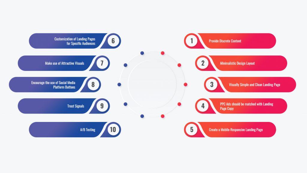
1. Provide Discrete Content
Your landing page’s content should be brief and to the point, emphasizing your Unique Value Proposition (UVP). The content you provide on the landing page will be determined by the type of products or services you are trying to promote and market.
Keep in mind that you just have around eight seconds to persuade users that your offer is worthwhile. Excessive information might overwhelm visitors and cause them to abandon the website quickly. So, speak to your audience in clear language and explain to them how you can provide solutions to their problems.
Important Text Components of An Effective Landing Page
A. A Compelling Heading
Any visitors bumping upon a website will first come upon the header. It is where you get your first chance to create an impact on conversion rates. Always use a headline that clearly highlights the important benefits of your products. This will enable the visitor to know and understand what exactly are they going to get on your landing page.
The headlines of a landing page should give an important chance to demonstrate the value of your service. Most effective landing pages affirm the offer with the headlines and utilize the subheadings to further describe the offer to communicate the value proposition. Thus, it is essential to make sure that your header must be specific in explaining what the viewer will ultimately receive from your landing page.
B. Subheading
The most effective landing pages employ the headline to convey what is being provided and the subheading to further clarify the offer and share the UVP. Subheadings help to highlight what you’re giving in a different light. Some landing pages include their value propositions in the header and utilize the subheading to explain the actual offerings. Make sure your campaign’s offer and value proposition are clear and persuasive to the audience before they make a decision.
Your subheading must complement the header of your landing page. When consumers arrive at your website, they must immediately grasp what products or services you are providing and they must click the call-to-action button for the ultimate outcome.
C. Catchy Call To Action Button
Create eye-catching and clickable Call-To-Action (CTA) buttons that entice visitors to buy, sign up, request a trial, or do anything else. CTAs should be placed at the top and bottom of the page so that visitors do not have to scroll all the way up to click.
Alternatively, you can also include a floating CTA button that is constantly and clearly visible. Your CTA buttons must look beautiful to entice and attract the audience. To make the CTA buttons look more attractive try to incorporate animations to delight visitors, which would add to the overall image of your company.
Check that your CTA message and the landing page header are in sync with each other. If your header does not match your call to action, visitors can become confused, wondering if the CTA is linked to the wrong page.
Make sure to remove all ambiguity by ensuring that your text content corresponds to what you promised in your Call To Action. You will lose your users’ confidence if your CTA has a purposeful catch.
D. Forms for Lead Generation
When creating an effective landing page, try to keep your forms concise and ask for only the information that is required. When it comes to building a strong and good landing page design, the notion of less is more and thus should be followed extensively. Moreover, you can always ask for more information on the thank you page.
Users don’t mind giving out their names and email addresses in general. If you request phone numbers or dates of birth when they are not required, visitors may be discouraged from filling out these forms for fear of receiving unwanted text messages or phone calls.
2. Minimalistic Design Layout
A strong landing page design should be able to deliver all of the necessary information needed to entice visitors and propel them to convert into potential customers. But in the process of providing information, don’t cram too much on the landing page to make it look messy.
Instead, strive to make the design layout simple. Before creating a layout design, keep the following points in mind:
- Neat and visually attractive layout
- Use bullet points to make the content easier to grasp.
- Easily scannable content
- Highlight the offer’s main aspects.
- Utilize clickable videos to explain the details.
3. Visually Simple and Clean Landing Page
The primary goal of any landing page is to convert a visitor into a possible target buyer, thus all of the components of a good landing page must convince the user to perform the essential step of the purchasing process.
The design, feel, and structure of an effective landing page have a huge impact on its success in deciding conversion rates. Thus, you must consider a few pointers while designing a top-quality landing page.
- A good landing page design should be simple and appealing, offering information in an unobtrusive manner.
- To avoid confusing the consumers with unnecessary visual components, employ a simple and clean, and well-organized layout with ample white space to put enough focus on the products.
- Examine the layout of your website at various resolutions to ensure that even individuals with outdated displays can view your heading and CTA without scrolling.
- Choose larger fonts to ensure that the visitors can easily read and comprehend what your landing page is about.
- To increase conversion rates, employ eye-catching graphics with smart use of colors such as red and green buttons combined with a high contrast backdrop to highlight the primary elements.
- Most of the visitors scroll down for additional information, so try to include blocks that only appear when a page is scrolled down.
- Verify how your landing page layout design looks on mobile devices as the majority of the purchases are made by mobile users.
- Also, make sure that your design of the landing page is lightweight and quick to load.
4. PPC Ads should be matched with Landing Page Copy
An efficient landing page design ensures that the words in the page content correspond to the keywords and language in their PPC advertising. The use of the same terms and key phrases reassures visitors and demonstrates consistency.
It is critical to offer top-quality content directly to the target audience. To get the highest conversion rates, always match up to the user’s requirements.
Also Read, Top 5 Key Elements of a Website for Ensuring Success
5. Create a Mobile-Responsive Landing Page
Make sure your landing page is mobile-friendly, as mobile accounts for approximately 30% of all web traffic. A mobile-friendly website has the potential to significantly enhance conversion rates. You must make efforts to make your landing page look good on mobiles. The design of the landing page should be simple to use, quick to load, and clickable.
6. Customization of Landing Pages for Specific Audiences
The landing pages should be customized to cater to a diverse group of audiences. If you have a terrific offer and have been effectively advertising it, you will most likely be receiving traffic from a variety of sources that are pretty distinct from one another.
A user who arrives at your landing page via social media sites such as Facebook or Twitter is not exactly the same as a person who arrives via a PPC ad or a link in your monthly newsletter. The audience of each group is different and must be treated differently.
Thus, it is usually preferable to approach each group of audience in a unique manner by personalizing the landing page according to the specific groups of people.
7. Make use of Attractive Visuals
Just like text, photos have the capacity to immensely improve how people interact with your offer. Humans can process and interpret meaning from what they see thanks to their visual reasoning ability. Visitors benefit a lot from visual cues to learn more about your company. Provide high-quality images of your product or service’s top features. Hire a photographer that understands visual methods and can provide you with photographs that convert.
A luxury brand application in which we placed a backdrop image of a watch on a man’s wrist to underline the company’s elegant character and give a sense of refinement.
8. Encourage the use of Social Media Platform Buttons
Try to include social media sharing icons on your landing pages so that your consumers can easily spread the news about your business across a larger group of people on various social media platforms to reach a wider group of audiences.
Social media sharing icons serve as a kind of word-of-mouth promotion. Try to incorporate only the buttons for social sites that your target audience uses extensively to avoid clutter.
Also, include an email forwarding option, as individuals still prefer to share information via email.
9. Trust Signals
Trust badges are another significant trust indication that helps in designing top-quality and effective landing pages. The emblems of well-known companies that have previously been connected with you are referred to as Trust Badges. They serve as reputation enhancers to boost your credibility on the landing page.
A successful landing page makes extensive use of trust signals, signalling to visitors that their promotional offer and brand are trustworthy.
Likes, comments, testimonials, and badges are all forms of trust signals and are the main components utilized by companies to showcase the trust of the customers in them.
Testimonials are a traditional type of trust signal that rely on word-of-mouth recommendations to comfort visitors with endorsements from previous customers. This can also be done using “Likes” from numerous social networking sites.
You might also like,
What is Web Design? The Ultimate Guide To Designing a Website
10. A/B Testing
Running a trial test is the final part of creating an effective landing page. It is difficult to design good quality and effective landing page without conducting extensive and proper A/B testing.
To check out the effectiveness of your landing page you must conduct A/B testing to obtain vital information on how people engage with the audience to increase the conversion rates on the landing pages.
Testing and tracking results are critical for assessing the performance of your landing page prior to its final implementation. What you test relies heavily on the source of your traffic and the end goals
Google Analytics can help you determine whether your landing page is effective enough to bring conversions. You can monitor how people arrived at your website and what device they were using to reach there. You can also measure how frequently visitors clicked a button, watched a video or submitted a lead form.
A/B testing can be done on the following:
- Headings CTAs
- Graphics and images
- Trust Signals
- Buttons (look, text, and location)
- Page element placement (blocks)
- Quotes from the press
- Links to other websites
Thus, one of the most vital components for designing high quality and good landing page is to conduct the A/B testing for increasing the conversion rates.
Wrapping Up
Landing pages are single pages that focus on a certain topic or campaign. It is this focus that makes landing pages the best alternative for raising the conversion rates of any marketing campaign.
A good landing page should clearly present the offer and be clear enough to describe its worth to the audience in simple words so that they can make a favourable purchasing choice.
Using the best practices for designing landing page businesses can effectively enhance the conversion rates leading to higher organizational growth and profits.
Frequently Asked Questions (FAQs)
What is a landing page?
In digital marketing, a landing page is known as a “lead capture page” or a “destination page.” When a visitor clicks on a search engine optimized result, a single web page appears.
Landing pages are tailored to a particular campaign or offer and direct visitors to a single call to action. In a nutshell, landing pages are intended to convert visitors into customers.
Landing pages are the digital counterpart of a marketing plan focused on certain objectives. A landing page’s primary objective is to lure visitors and persuade them to do certain actions by leveraging targeted marketing campaign content.
What is a landing page design?
The process of designing an engaging appealing website page for your target demographic and website visitors is known as landing page design. An effective landing page design should urge them to move from just being leads to being upgraded to subscribers or customers.
What is the difference between a landing page and a website?
The prime difference between a landing page and a website is their focus. Landing pages are tailored to a specific campaign or offer and direct visitors to a single point of contact. Landing pages are designed with the main objective of converting visitors into potential customers.
How can you design a top-quality and effective landing page?
You can design a good, effective and successful landing page by following a few tips that include factors like:
- A compelling heading
- Subheading
- A catchy Call To Action (CTA) button
- Lead Generation forms
- Minimalistic Design layout
- Clutter-free landing page
- Use of attractive visuals
- Mobile-responsiveness
- Utilizing Social media buttons
- A/B Testing
- Trust Signals
