The light vs dark mode in Mobile app & web debate in digital design is no longer a fad, but rather a tactical move in digital design that not only affects usability and accessibility, but also emotional appeal to the audience. In either creating a mobile application or a modern website, the question of which mode to choose is no longer solely about aesthetic consideration, but about how your product is experienced by people.
Being a web design company or someone who provides web development services, knowing the impact of light and dark mode on perception, functionality, and user behavior can help your design projects win the competition game. This detailed tutorial examines the psychology, usability, and design issues surrounding both of these modes and aids you in determining how to apply them successfully.
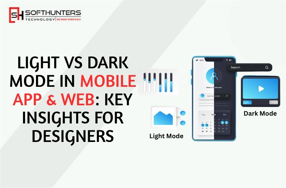
What is Light Mode?
The conventional design environment, in which dark text is printed on a light ground, usually white or pastel colors. The default option has been used by most websites, applications, and operating systems over the decades.
Why It Works
- Excellent readability in bright conditions: High contrast between black text and white background allows reading content more easily in the daytime or in well-illuminated conditions.
- Light backgrounds: The light backgrounds of the print media are familiar and trusted by most users.
- Long-form reading: Blogs, articles, and interfaces rich in text are ideal to use in light mode because it feels natural to read large amounts of text.
Challenges
- Low light strain: It can result in glare or low light discomfort when used for long periods in low light.
- Power consumption: During light mode, OLED displays can consume more energy due to the high power consumption of bright pixels.
- Lack of visual drama: Light mode can be pretty unimpressive and even lower in contrast compared to dark mode.
What is Dark Mode?
Dark mode is one in which the text is dark on a dark background (usually black or dark gray). It is visually attractive and has become popular because of social networks such as Instagram, YouTube, and the dark theme of macOS.
Why It Works
- Less eye strain at night: A darker interface produces less light, and thus, it is less straining to the eye in a dark setting.
- Battery efficiency: OLED and AMOLED displays have black pixels that consume less energy and therefore have a better battery life.
- Premium and modern: Dark interfaces typically look and feel more film-like and slick, which can be appealing to design-conscious users.
Challenges
- Readability problems: Long reading on a dark display might be taxing, as the light text on a dark background produces a halation (glow effect around text).
- Underperforms in sunlight: Dark mode is not the best at being used outside, where the screen reflection obscures the display.
- Unsuitable across the brands: Light or light-hearted brand identities can end up losing their core in a dark color palette.
The Psychology Behind Light and Dark Modes
Color and contrast do not simply influence visibility, but also influence emotional responses and brand perception.
Light Mode Psychology
Light grounds are clear, simple, and open. They inspire positive feelings of optimism and safety, and are perfect to:
- Educational apps and blogs
- E-commerce platforms
- Wellness and medical sites.
- Corporate or professional services.
Light mode helps to support the story when a web design firm creates a brand identity based on trust, transparency, or learning, on behalf of the client.
Dark Mode Psychology
Dark interfaces are sophisticated, powerful, and exclusive. By reducing distractions, they establish focus, which can result in more immersion in content. Dark mode suits:
- Apps streaming media (Netflix, YouTube)
- Design and creative portfolios.
- Tech and gaming websites
- Luxury or lifestyle brands
When the website development services are focused on startups or creative individuals, the interface can be futuristic and slick with the help of dark mode.
The Science of Readability and Eye Comfort
The human eye is adapted to darkness-on-bright conditions (such as day), so light mode is the default mode. But research indicates inconclusive findings concerning the best mode when it comes to the eyes.
- In sunny conditions, Light mode prevails. It is also readable and minimizes eye strain due to screen reflections.
- During low-light or nighttime, Dark mode is in effect. It reduces glare and exposure to blue light, which contributes to relaxation of a user before sleeping.
Practical Tip for Designers:
Use both modes. The ability to offer users a light/dark setting gives the flexibility based on their surroundings and personal preference, which is now a standard feature of most modern applications and websites.
Typography Considerations
In both modes, typography is important to the readability of your design.
In Light Mode
- Text should be in dark gray or charcoal, not in pure black it is less harmful to the eyes.
- Keep contrast high without causing the text to be too harsh.
- Do not use excessive white space that may lead to eye fatigue.
In Dark Mode:
- White (#FFFFFF) on black (#000000) has too much contrast and glare. Rather, write in off-white or light gray.
- Make letter spacing and line height a little larger.
- Select lighter accent colors that do not contrast with the dark background.
Color and Contrast Principles
Contrasting color influences the appearance of your design to users with eye problems.
Contrast Ratios
- As WCAG (Web Content Accessibility Guidelines) states:
- Minimum contrast ratio of normal text: 4.5:1
- Minimum for large text (18pt+): 3:1
In Light Mode
Make sure that the elements, such as buttons and icons, are visible against a bright background. Wisely use accent colors to highlight important areas.
In Dark Mode
Be very careful about balancing dark; too much darkness kills out depth. Add some more lines of highlights and shadows to provide hierarchy and division.
User Experience Differences
Light Mode UX
- Easier to use: It is simple to distinguish between different sections as well as read the content.
- Professional look: Displays well on business and informational sites.
- Best to use during the day: It is used mainly by the working population.
Dark Mode UX
- Minimalistic: Filters visual clutter and maintains content focus (immense when using videos, galleries, and dashboards).
- Prefer to work in low light: Has a more realistic experience.
- Fashionable and cool: Reach out to younger and more technologically oriented customers.
To more dynamically improve the user experience, designers who provide web development services usually provide theme detection and an automatic ability to switch modes, depending on system settings or time of day.
Brand Identity and Visual Consistency
The design option that you make should match the personality of the brand.
Light Mode Brands
- Familiar, open, informative, or service-oriented (e.g., Google, Airbnb).
- These brands are based on transparency and availability.
Dark Mode Brands
- Futuristic/creative/luxury-oriented (e.g., Apple, Tesla, Spotify).
- Dark colors symbolize images and give exclusivity.
To perfect a mode, a professional web design company takes into consideration brand colors, the tone, and the psychology of the audience, so that both modes fit perfectly.
Implementing Light and Dark Modes Effectively
1. Use a Neutral Color Palette
Select underlying colors that change well between light and dark themes. Neutral colors such as gray, beige, and navy are good throughout.
2. Designing with Permanence in mind
- Compare accessibility tools.
- Shun solid black or solid white backgrounds.
- You must make sure that icons and illustrations are readable in both modes.
3. Apply Gradients and Shadows to Depth.
Dark interfaces may be flat. Include darker shades behind your design or even slight lines to make your design have some structure and a realistic nature.
4. Let Users Choose
A theme switch furthers individualization. You can even enable the interface to follow the user-preferred device using CSS media queries (prefers-color-scheme).
5. Test in Real Conditions
Always view your designs in various lighting conditions, bright daylight, indoor lighting, and at night, to ascertain the best readability and beauty.
Passing Case Studies: When Light and Dark Work Best.
Case 1: Productivity Apps (e.g., Notion, Slack)
Most productivity tools have both modes due to the fact that the user will be working all day long. Light mode when visibility is good; dark mode when it is late.
Case 2: Streaming platforms (e.g., Netflix, YouTube)
Dark mode dominates here. It increases visual engagement and lessens the distracting nature of the material.
Case 3: E-Commerce Websites
Light mode is also still popular because it emphasizes products and creates confidence with visual clarity. Nonetheless, a high-end appeal is sometimes applied to luxury e-commerce brands via dark backgrounds.
Case 4: Portfolios and Creative Studios.
Dark mode makes images more prominent and should be used by photographers, designers, or filmmakers because it has a cinematic, artistic feel.
The Developer’s Perspective
To a web development services provider, to develop two themes effectively, one needs to:
- CSS Variables: Establish color tokens and reuse them to quickly change themes.
- JavaScript or React Context: Control user preferences.
- Performance Optimization: optimization of massive image assets that do not change between themes.
- Testing: Make sure you have third-party elements in line with your color schemes.
Close interactions between developers and designers are required to ensure consistency in the UI elements when switching between modes.
The Future of UI Themes
The increasing popularity of system-level theme switching (Android, iOS, macOS, Windows) is an indicator that dual-mode design is emerging as a new norm. Users are demanding customization and power.
Designers and developers will work in the next few years on:
- Variable or adjustable color systems.
- UI energy-saving and optimum display performance.
- Emotional design in which the color mode varies in accordance with the user’s mood or situation.
Final Thoughts
Light or dark mode is not only a matter of aesthetic choice anymore: it is a user experience strategy. The most effective designs are versatile, user-friendly, and user-sensitive.
Being a modern web design company, you need to advise the clients not only on what looks good, but what will feel right to their audience and brand identity. Likewise, you can add value to your projects by providing web development services that also offer seamless switching of modes and optimization of accessibility.
Keep in mind, good design does not mean to abandon one side in favor of the other, but rather, it is about the balance of visibility, comfort, emotion, and brand storytelling.
You may go gay and open or dark and enigmatic, but in all events, you ought to aim at the same thing:
Design for people, not pixels. Amigos!